M1 Spend Credit
M1 — B2C — Mobile/Web

Project Overview
Timeline: 6 months (MVP), Released in October 2021
Team: Product Manager, Product Designer, iOS Engineer, Android Engineer, Web Engineer, Lens (API) Engineer, Test Engineer
M1 has a vision of being a finance super app, a one-stop shop for all financial needs. In 2021, M1 decided to enhance its Spend (banking) offerings. At the time Spend only consisted of a single checking account that could earn 1% APY and 1% cash back with its membership subscription. To get closer to the vision, M1 launched a credit card that integrated with the rest of the platform.
Research & Discovery
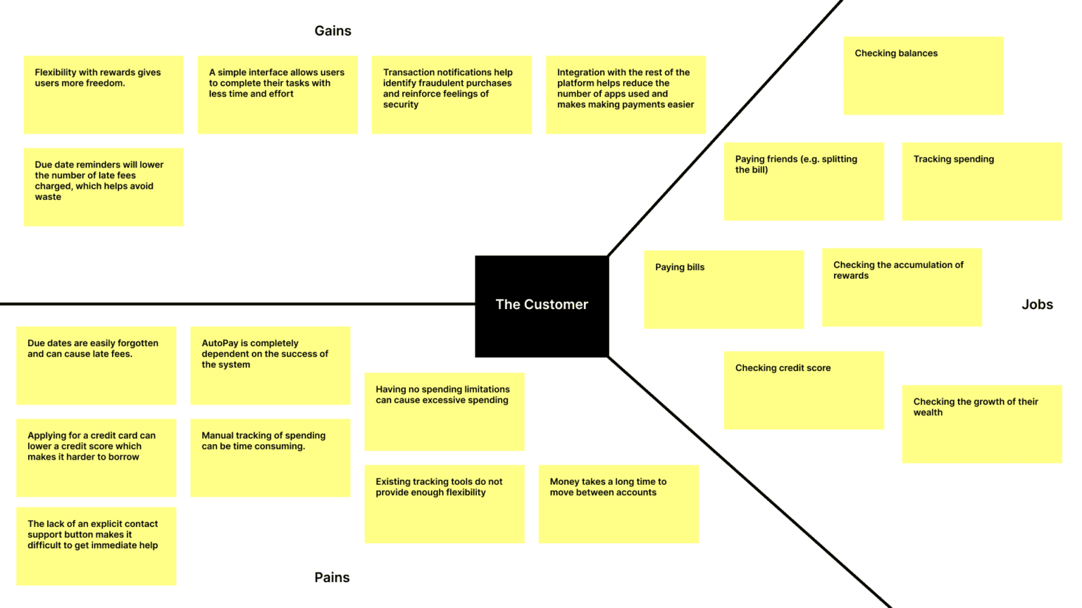
The credit card experience has been around for decades. When web apps and mobile apps became the norm for financial institutions, standards were developed that we can see today across different banking platforms. We did not want to just make a copy of what's out there today, we wanted to innovate. With this in mind, I developed a questionnaire and worked with our researcher to distribute it to a sample of users to better understand who used credit cards, how they used them, what they used them for, and sentiments around a credit card provided by M1.
Key Research Findings:
Most of the respondents were credit card users. Those who were not, commonly noted that they were either debt aversive or scared of impacting their credit score.
The top 3 card types were cash back, travel, and gas/restaurant.
75% of the respondents had their credit card for more than 10 years.
When it came to why our users used credit cards it was evenly split between everyday purchases, large purchases, emergencies, and special purposes.

Project & Planning
Once we gathered all the information from the research, I worked with the product manager to further define the milestones and scope of the project.
M1 is not a bank, nor a credit card provider, so we worked with a third party to achieve our goals. Unfortunately, we had to switch third-party partners which limited some of our initial ideas. Eventually, we were able to commit to a partner (Deserve) who would help us meet our goals. We decided to move forward with the following milestones for MVP release:
Application process from start to account opening
Card activation, lock card, statements, and contacting support
Transaction ledger, transaction details
Credit card balance payment, autopay (This was handled by another designer and will not be further covered in this case study)
Rewards tracking and redemption
Navigation & Layout Exploration
Before we could get started with this project, I needed to determine where the credit card experience would live. There were three possible locations: an individual tab, the Borrow tab, and the Spend tab. To maintain a simple navigation system and because the nature of the credit card aligned best with Spend, I decided to place the credit card experience within the Spend tab.
Once the location was selected, the next objective was to ideate possible solutions that best supported Spend checking and Spend credit living in the same space. I organized a crazy 8s workshop with stakeholders and engineers to gather ideas and to learn more about what was feasible.

The idea that received the most votes featured a card slider system that switched the view based on the selected card. I proceeded with this idea and added additional features that were favored to the design solution
Scope Creep & Strategy
What happens when product visions collide? Scope creep. There were discussions around an overview for Spend that was more comprehensive. This would include more robust insights, budgeting, and goal-setting systems. We wanted the user to have a full picture of their financial landscape when making decisions. For example, we wanted a user to easily see if they had enough money in their checking account to pay their credit card bill. I explored a few options that checked many of the boxes, but it was determined that we just did not have the data nor resources to build something that robust. To best remedy the conflict and at least tackle the example above, we committed to making tweaks to the design that would give the user a better picture of what is happening across both account types without the need of switching views.

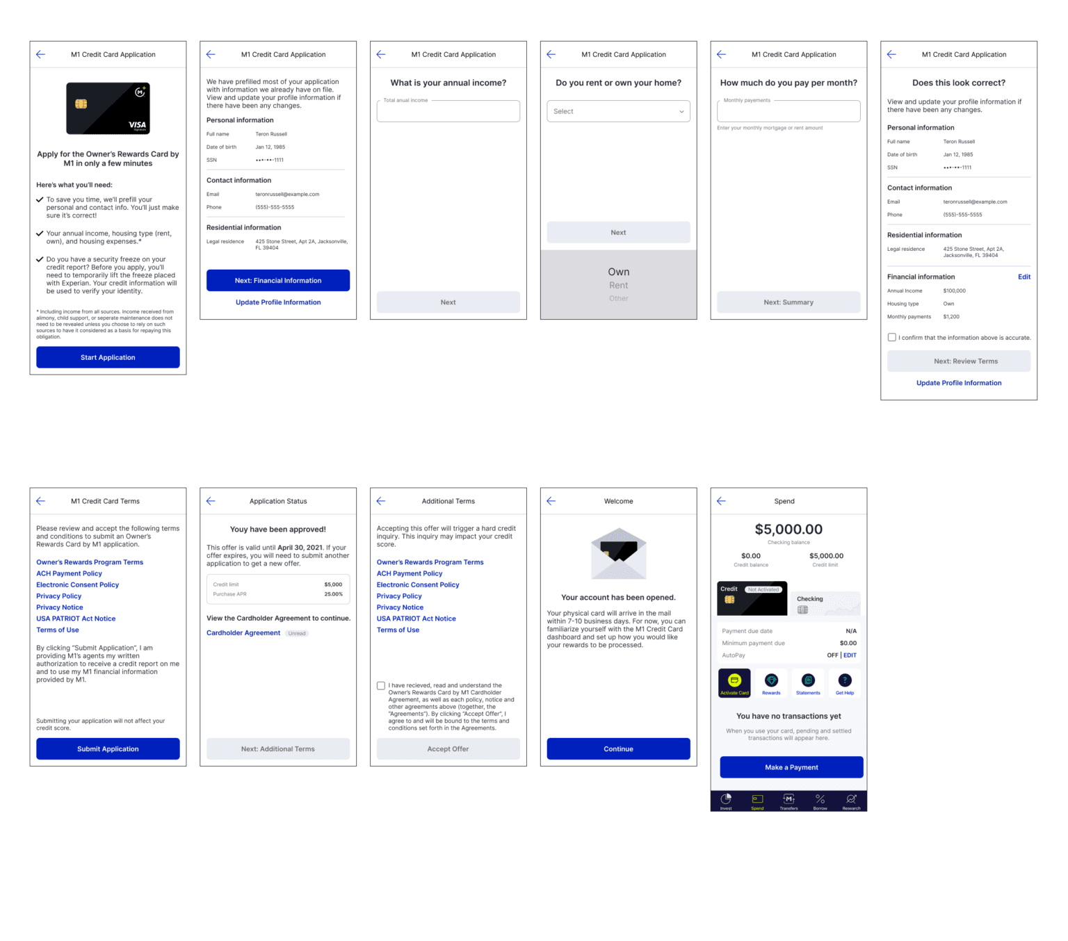
Application process
I wanted to make the credit card application as easy as possible, so we leveraged the data we already had to pre-fill most of the user's application. The user was only required to answer three required questions from Deserve to submit their application. Application decisions were usually instant if there were no hiccups, such as a credit freeze.
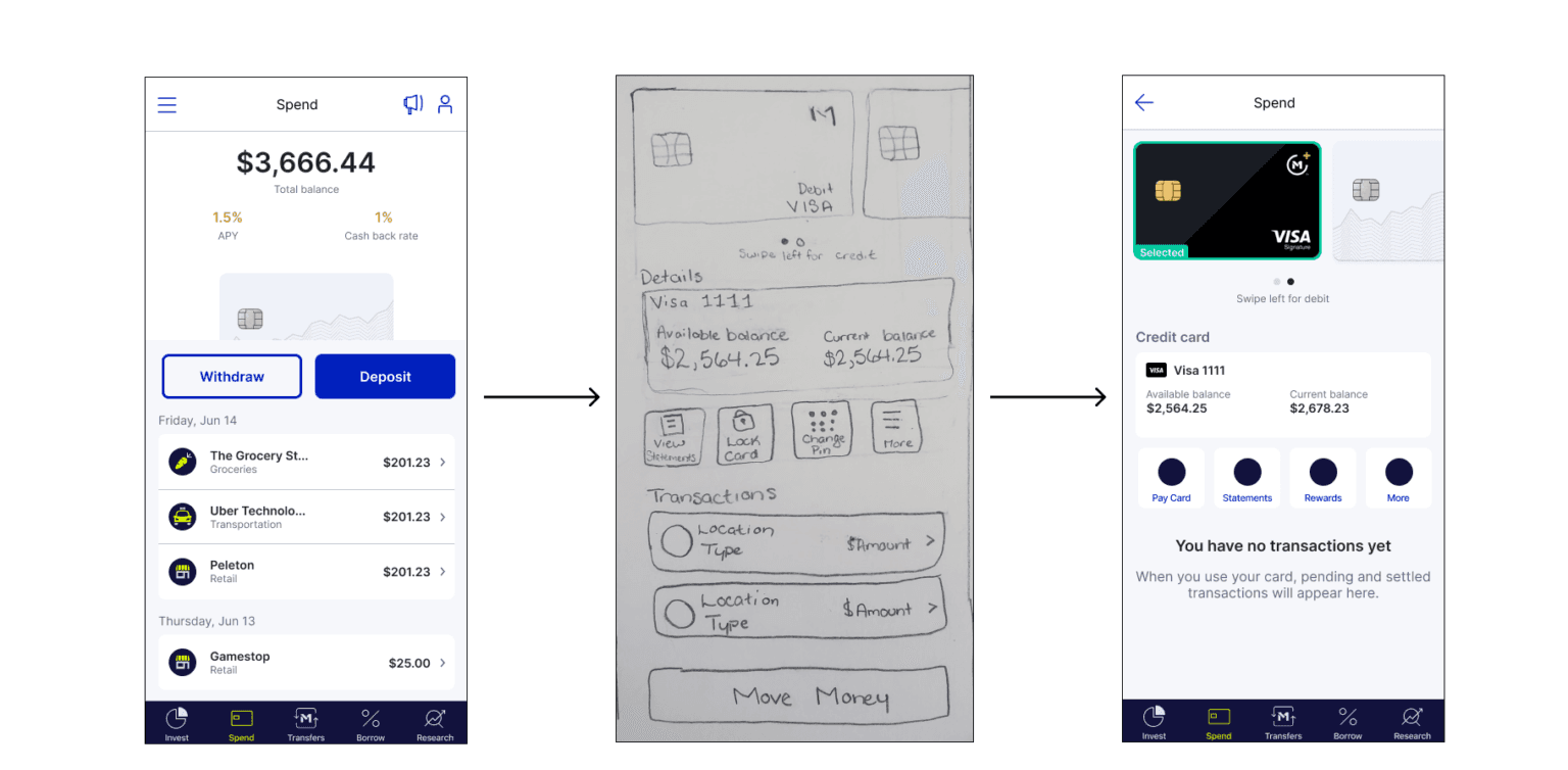
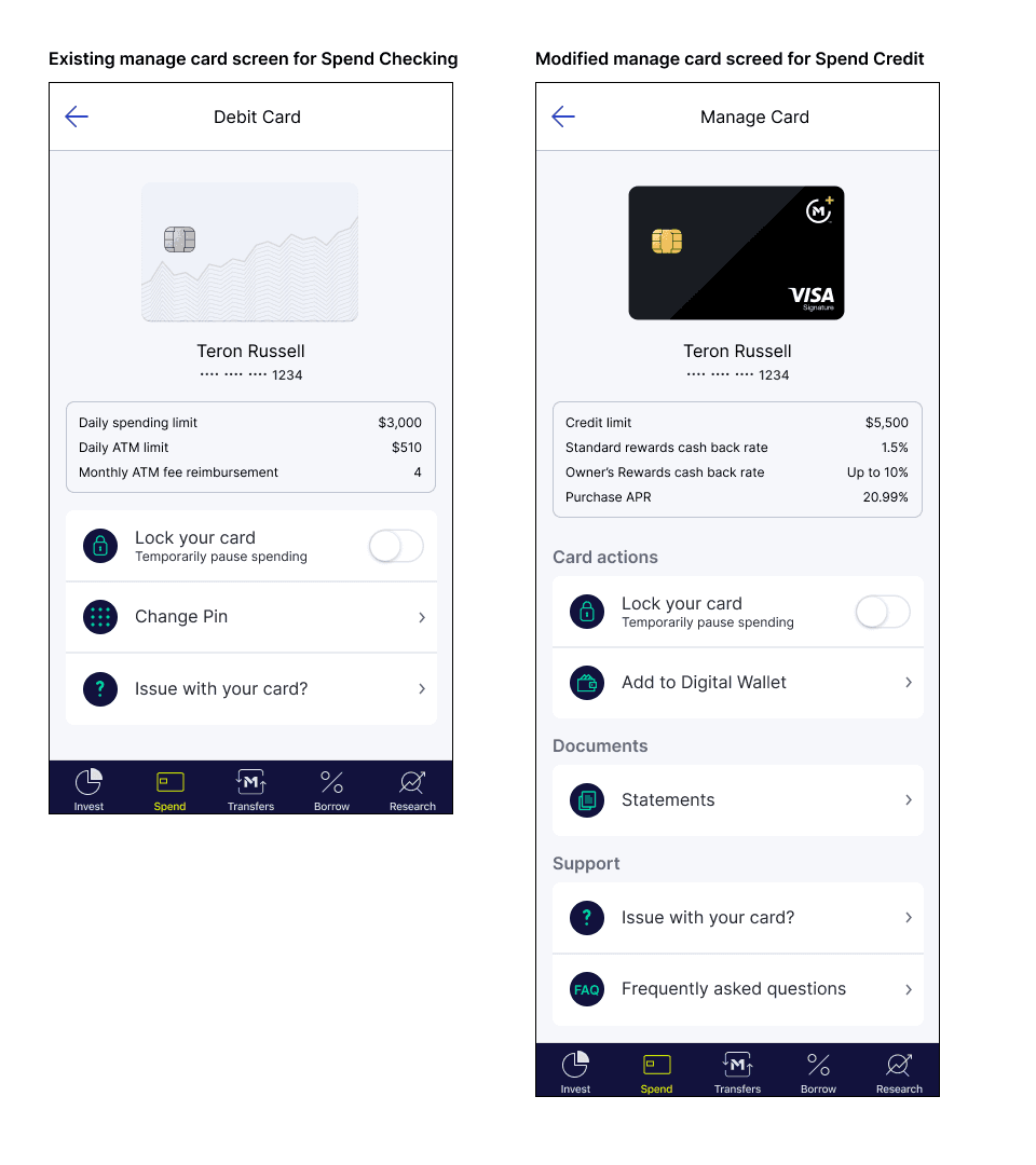
Card management
The manage card screen reflected what already existed in Spend checking. There were engineering limitations where any layout changes that were made on Spend credit would also affect Spend checking. To ensure we were able to meet engineering timelines, I decided to only make minimal changes such as swapping out data points and categorizing the actions that could be performed on the page.
We allowed users to immediately add their card to Google Pay or Apple Wallet upon card activation for further user convenience.

Transactions & Ledger
I wanted to be cohesive with spend checking, so I mimicked the transaction ledger that existed. Each purchase with the credit card fell within a reward tier. Therefore, I noted the cashback percentage that would be applied to each transaction. The transaction details page was also updated to show the percentage of cash back for the purchase.

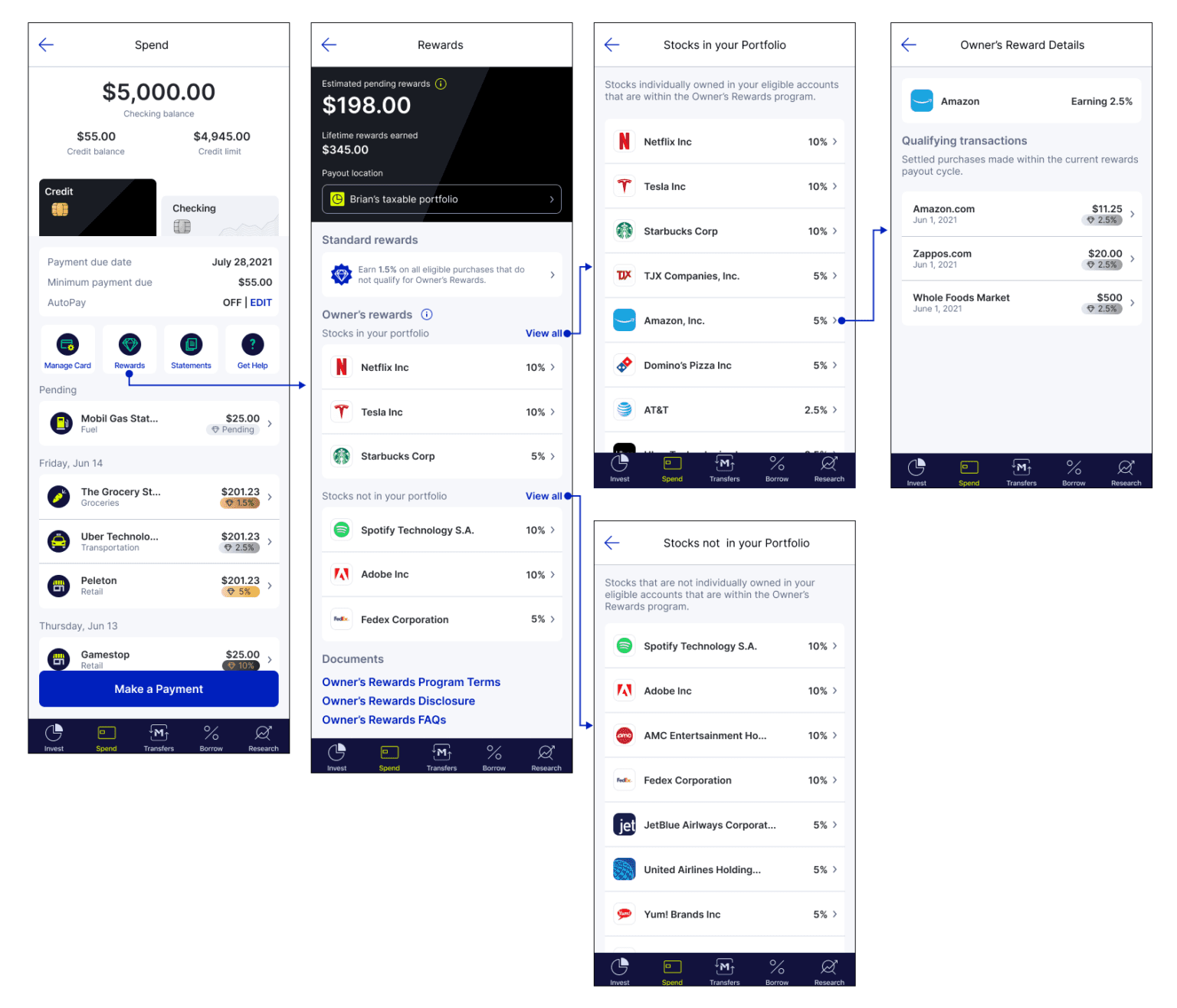
Rewards (Key Differentiator)
Earn was the key milestone of the credit card experience that differentiated M1's credit card from competitors. To be more integrated with the platform, a business decision was made to tie cash back rewards with the user's stock holdings. M1 selected stocks at frequently shopped merchants and organized them into three cash back categories: 2.5%, 5%, and 10%. Any other purchase would qualify for a flat cash back rate of 1.5%.
I sectioned the page into three segments: reward information, stocks in your portfolio, and stocks not in your portfolio. In the rewards information section I let the user know their estimated rewards for the billing cycle. I decided to show the user their total lifetime rewards to highlight the accumulated value since signing up for the card. Within a year, I saw the positive effects of this decision when users began sharing their rewards on social media and sharing that they had earned their M1 annual fee back in rewards.
The last thing featured in rewards information was payment location settings. The user was able to transfer their rewards to Invest which could later be auto-invested or transferred to their Spend checking as cash.
Below the rewards information, users could see what reward-eligible stocks were in their portfolio and drill deeper to see the transactions that tied to a specific stock. Users could also see what reward-eligible stocks were not in their portfolio that would earn the standard rate of 1.5% unless added. In the initial design, I enabled the user to add reward-eligible stocks that were not in their portfolio from the rewards portal, but compliance barriers drove the decision to omit the feature.
Testing & Iterations
Two rounds of testing were held once the MVP features were functional. The first round of testing involved the voluntary participation of employees. Our second round of testing involved early access users. To gather feedback about the experience, I designed an in-app early access card component that allowed users to provide feedback through a ticket. This data was aggregated by our operations team and presented in a weekly report. We used this report to identify functionality bugs and feature opportunities.
The early access feedback funnel was very successful in providing insightful data. We decided to extend the use of it through the end of the year and used the gathered feedback to prioritize features for a 3 month roadmap.
Launch & Outcomes
The process of getting to this release was not an easy one, but we managed to launch the credit card in October 2021. The credit card team was the first group structured in M1's pod system during a period of rapid growth. This required us to be the trailblazers in developing efficient processes. The rituals that were the most efficient were project and design-focused stakeholder reviews, back-end syncs, third party syncs, and retrospectives. Each of these meetings were integral parts that either removed roadblocks, increased understanding through communication, or improved the process.
Overall, it was the team's ability to collaborate that ensured the launch of the credit card.